





Photography is not just about freezing memories. It’s telling a story. But taking really eye-catching pictures? There’s more to this than pushing a button. You have to understand the light. You have to think about the composition. Perspective matters. The same goes for colors. And the contrast? This gives the image its “feel”. Ready to upgrade? Here are 5 ways to take beautiful photos that actually work.
Control natural and artificial light
Light is everything. It sets the mood of the picture. Without it, there is no picture.
The best photographers don’t just wait for the sun to shine. they chase it. They manipulated it. The golden hour (time after sunrise to sunset) provides soft, warm light. This was a time when portraits and landscape photography were popular. The shadows are long. The colors are very rich. But what if you’re indoors? Or what if you were shooting at night?
You need to know your light source. Is it harsh? Is it diffused? Harsh light creates hard shadows. It can look unflattering on faces. Diffuse light surrounds the subject. It’s softer. It’s more forgiving.
“The light is the paint and the camera is the brush.”
Don’t fight the light. Work with it. If the sun is too bright, seek shade. Use a reflector. Or wait. Patience is the photographer’s best tool.
Composition: Breaking the Grid
Most people are taught the rule of thirds. It’s very simple. Divide the frame into 9 equal parts. Place your subject along those lines or at their intersections. it works. It’s safe. But it can also be boring.
Why follow the rules? Composition is about guiding the eye. It’s all about balance. It’s about tension.
Try to frame it. Use doors, windows or trees to create a natural frame around your subject. This adds depth. It captivates the audience. It creates a sense of place.
What about perspective? Don’t just shoot at eye level. Get low. Get high. Shoot through objects. Change your angle. When you change your perspective, everyday landscapes become extraordinary.
The emotional power of color and contrast
Colors tell a story before you even read the caption. Warm colors—reds, oranges, yellows—evoke energy. passion Heat. Cool colors—blues, greens, purples—bring calm. distance melancholy
But it’s not just a matter of which color you choose. It’s about how they interact. Contrast is key. High contrast creates drama. It makes the picture pop. Low contrast feels dreamy. soft Ethereal.
Think about the feelings you want to convey. A lonely street at night? high contrast Stark shadows. Spring meadow? Contrast is low. Soft pastel colours. Let your color palette guide your emotions.
Simplicity is the Ultimate Sophistication
Mess can ruin your photos. Too many elements can distract the eye. They create confusion. When taking photos, ask yourself the following questions: What is the subject of the photo?
Isolate it. Eliminate distractions. If there’s something in the background that doesn’t add value, remove it. Change your angle. Cut it out.
Simple does not mean empty. It means intentional. All frame elements are
Light is not only the element that makes visible, but also the element that determines the feeling. Improper lighting can clutter up a picture taken with even the best camera. When used correctly, it turns simple frames into a striking visual experience. Your goal should not be just to record, but to capture the atmosphere.
The sun is the most powerful natural light source. But watches change everything. At noon, when the sun is high, it creates harsh shadows. These shadows can hide details in faces or create unwanted harsh contrasts. The solution is simple: move into the shade. Filter the light by moving under trees, behind the building. This softens the light and provides a more even distribution on objects.
The situation is more delicate in portraits. Direct sunlight can flatten skin tones or cause glare on eyeglass lenses. A cloudy day is the greatest studio highlighter nature has to offer. Clouds scatter sunlight and create soft, shadow-free lighting. This is especially ideal for those who want to highlight skin details.
You can also include artificial light sources in this balance. Instead of just using direct flash, reflect the light by directing it at the wall or ceiling. This technique increases the softness of the light and produces a more professional result. Your goal is not to leave the model’s face flat and without detail, but to add depth and softness.
2. Adjust Framing and Composition

3. Create Perspective
Perspective adds depth. It gives a third dimension to an image on an ordinary plane. This means hierarchy and focus, not just a sense of distance.
This is what draws the audience into the scene. A flat photo is boring. The deep one draws you in. Where you draw from changes everything.
Why use a high or low angle?
Shooting from standard eye level is often sufficient. But sometimes you have to break the rules.
- Low angle: Magnifies the subject. It strengthens. It creates a repulsive effect.
- High angle: Makes the subject look smaller. It may feel fragile. It reveals details for a general view.
Follow the points where the lines meet. Vanishing point pushes the viewer’s eye deeper into the scene. This is one of the most powerful tools to tell the story of photography.
4. Use Light
There is no photography without light. It not only saves, but also separates the form into lines.
- Golden Hour: Sunrise and sunset. The light is soft. Colors are warm. Shadows are long.
- Serta Time: Noon. Hard shadows. High contrast. Flat lighting.
- Blue Hour: Just after sunset. Blue tones dominate. It creates a calm, mysterious atmosphere.
The direction of the light is also important.
- Frontal Light: Reveals details. But sometimes it can stay flat and flat.
- Side Light: Emphasizes texture. Texture adds depth.
- Backlight: Creates a silhouette. It creates a dramatic effect.
If you can’t control the light, at least try to understand it. Seeing where the shadows are is more important than knowing where the light falls.
5. Color and Contrast
Colors convey emotion. Warm tones give energy. Cool tones are peace.
- Complementary Colors: Contrasting colors. High contrast. It attracts attention.
- Analogous Colors: Neighboring colors. It’s peaceful. Compatible.
- Monochrome: Single color tones. minimalist. A powerful effect.
Contrast is the heart of the picture. High contrast images are harsh, dynamic. Low contrast images are soft, dreamy.
Check color saturation. Too much saturation looks artificial. Establishing a natural balance is always
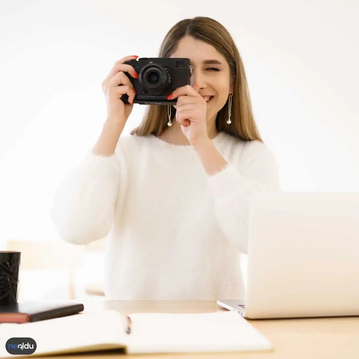
Perspective isn’t just about angle. Light and color also determine the rules of the same game. If a photo looks flat, the problem is likely due to a lack of contrast. Color and contrast control is the fastest way to draw the audience into the scene.
High Contrast: Dramatic Highlights
High contrast increases the difference between blacks and whites. Shades of gray are compressed. This approach is a bold choice. Sharpens geometric forms. Shadows deepen, bursts of light become more distinct.
What is the trick of this job? Direct sunlight. Mid-day sun creates harsh shadows. These shadows add that “feel” to your photo. For example, consider the forked shadow on the wall of a building. These shadows make a plain wall no longer an ordinary detail.
If you do not want to lose gray tones, there is something you need to pay attention to. Making shadows completely black can result in loss of detail. However, a slight “cut-off” creates a modern, clean look. This style is especially effective in architectural photographs or black-and-white conversions.
Low Contrast: Soft and Dreamy Atmospheres
Let’s think in reverse. It’s a cloudy day. Or a foggy morning. The light is scattered. There is no shadow. This creates low contrast. Colors shift to paler, more pastel tones.
When to use? In portraits. Softens skin tone. Hides wrinkles or skin imperfections. It results in a natural aesthetic. Also, if you are looking for a melancholic or peaceful atmosphere, low contrast will do it.
But be careful. Too low contrast can make your photo look like “mud”. A visual clarity is lost. What is the solution? A slight tone adjustment. Darken the blacks a little and lighten the whites. This preserves softness while keeping the image vibrant.
Color Harmony and Contrast: Directing the Eye
Colors are not just ornaments. Direction data.
Complementary colors (blue and orange, red and green) contrast with each other. This contrast is a powerful tool to capture the viewer’s attention. When you enter a scene, your eye finds the most contrasting color first.
How to use?
– Main topic
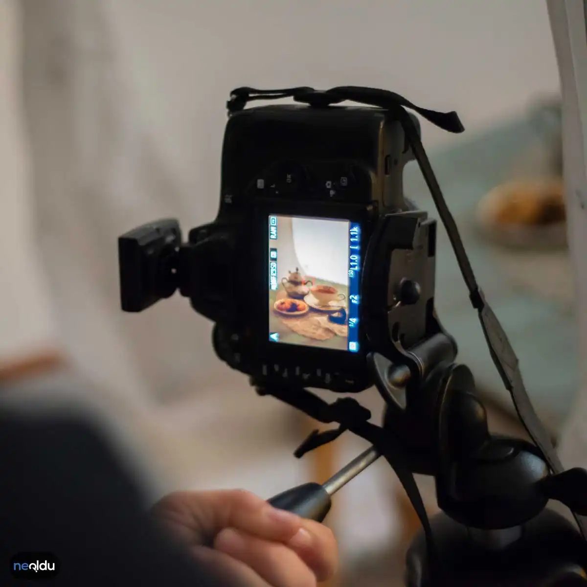
Color is not just a visual detail, it is the pulse of the photograph. Contrast determines how hard or soft that pulse will beat. When you don’t use them correctly, even the best composition remains flat and forgettable. So, how do you control this duo with technical tools?
First of all, do not be hostile to the color wheel. It works like a simple map. Understanding the relationship between primary colors (red, blue, green) and their mixtures (orange, purple, yellow) will prevent you from getting lost in the editor. Warm tones — red, orange, yellow — exude energy. Cool tones — blue, purple, green — are calming. If you make a conscious choice, you pre-program the feeling you will create in the audience’s chest.
As for the contrast issue. Opposite colors call each other. When you place a yellow flower against a deep blue sky, you create tension, not just two colors. This causes the eye to stop and look. The opposite situation is also possible. Combining colors from the same family (monochrome or analog palettes) creates a smooth transition. A smooth, not sharp reading experience.
Taking control with Post-Production
Once you take the photo, you’re done. Frankly, the work only begins. Editor software (Lightroom, Photoshop, Captura One, etc.) gives you the right to do the rest. This is where balancing color and contrast comes into play.
It is possible to separate shadows and lights with tonality settings. Increasing the contrast “pops” the image by making dark tones darker and light tones lighter. But if you exaggerate, the details are lost. Saturation and vibrance settings determine how “old” or “dull” the colors will appear.
- Saturation : Increases all colors equally. Be careful. Skin tones may become artificial.
- Vividity : Emphasizes undersaturated colors, preserving oversaturated ones (usually red or blue). It is generally preferred for a more natural result.
- Tonal balance : If you do not set the white balance correctly, the entire color gamut will shift. A cool white balance turns a warm hour into an icy atmosphere.
Which software is better for which?
mobile

Editing is more than just finishing. This is where you can take raw data and force it to tell a story. You need the right tools to create the atmosphere. Adobe Photoshop and Lightroom dominate this space. They are heavy hitters. These programs can handle everything from correcting perspective to sharpening lost detail in shadows.
Correct exposure and balance
Exposure controls the brightness. If you make a mistake, the details will be lost. blown out highlights cannot be restored. Correctly adjusting the exposure balances the lights and shadows. This balance gives the image a grounded feel. Without it, your photos will look flat and cluttered.
Color correction and atmosphere
Color defines the feeling of a photo. You can shift tones. You can adjust the saturation. White balance correction ensures that whites look really white instead of yellow or blue. These changes change the visual appeal. They dictate whether the scene feels cold and distant or warm and inviting.
Sharpness and details
Software tools can improve clarity. This is important in portrait photography. You want to facial features to pop. This is also important for the landscape. You want every texture of each leaf or rock. Sharpening can reveal these hidden details. It makes the image feel more realistic.
Composition and cropping
Trimming changes the story. Eliminate distractions. You can highlight the subject. It can also adapt to different aspect ratios. This is useful in social media and in print. The composition becomes tighter. The focus becomes sharper.
Nature and landscape photography tips
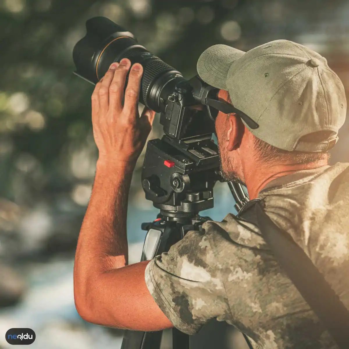
When light becomes your best partner
Light is more than just illumination. That’s all. Timing is everything in landscape photography. It’s not just pushing a button. I expect the atmosphere to change. This is why early mornings and late nights are a must for many shooters. These times are called the best hour.
Why are they important? Because the sun is so low in the sky. Light travels farther through the atmosphere, banishing harsh blues and leaving behind warmer, softer tones. This softness effectively reduces contrast. The shadows are not completely black. Highlights are not displayed. You can understand the nuance.
Think sunrise or sunset. The sky turns into a canvas of pinks, oranges and deep purples. Long shadows spread over the terrain and add surface images to smooth images. If you miss this window, you will miss the play.
Build depth without rules (but with rules)
Combinations are often thought of as a set of strict laws. It’s best to think of it as a tool to guide the eye. The rule of thirds is the most common starting point. Divide the frame into 9 equal parts. Place the horizontal line on the top or bottom line.
In coastal images, you can place the sky in the front third. Two thirds of the bottom is in water and sand. This keeps the image balanced and prevents it from getting boring. I feel very energetic.
However, the key to distinguishing a snapshot from a photograph is an interesting foreground. The mountains in the distance are beautiful. It is also static. Add rocks to the nearest foreground. Or a lonely tree. Or a piece of wildflowers. This locks in your audience. Give your eyes a rest before looking into the distance. Create a sense of scale. It’s not just about looking at pictures. You are looking at a photo. You stand there.
Devices that really matter
You don’t need the most expensive camera on the market. You need the right lens. Wide-angle lenses are standard in landscape photography. They captured the breadth of the scene. They are exaggerating the point. The foreground looks majestic and the background is far away.
Stability is the next hurdle. Hand-holding the camera with long shutter speeds can cause blur. In landscape photography, a tripod is not a luxury item. This is a requirement. Hold the sensor completely in place. This allows for long exposures without losing sharpness.
The filter is where the real magic happens. Polarizing filters can eliminate glare from water and leaves. It fills the sky with blue. Turn a gray and faded day into a lively one. Neutral density filters work like sunglasses with lenses. It is difficult for light to enter. This allows for a long exposure during the day. It can turn rushing water into a silky mist.
Freeze motion or blur in time
Nature is never static. The wind blows the trees. Water flows. Birds fly. The way you shoot the action determines the mood of the shot.
If you want to make the picture more impressive, increase the shutter speed. Drops from a frozen waterfall. Photograph each feather of a flying bird. I have a strong feeling.
For expressive flow, use a slower shutter speed. Long exposure makes the surface of the river flat. Create a dreamy and dreamy look. The water turns into a white mist. The grass sways in the wind
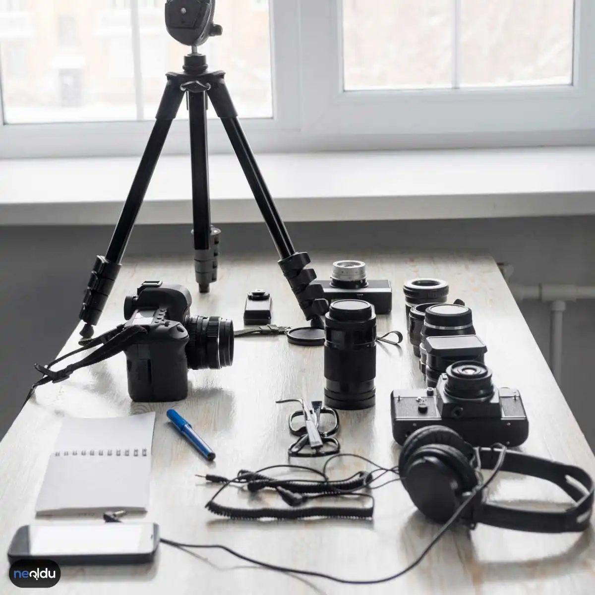
Art that captivates people
Portrait photography is more than photographing faces. It is an art form dedicated to freezing personality in time. You want your natural beauty and personality to show on screen. But getting there takes more than just pointing and clicking. It demands connection.
Build trust before you click
The best portraits are taken when the subject forgets the camera is there. First we need to build bridges. Chat. Make them laugh. Create a space where they feel safe. This comfort leads directly to a natural look. Forced smiles look stiff. Relaxed moments look real. It is up to you to arrange this relaxation.
Control the light
Just the basics. Strong direct sunlight can create unpleasant shadows under the eyes and nose. Look for soft, diffused light. Cloudy days are a gift. If the weather is sunny, move to a shady area. With the help of reflectors, you can also manipulate light and bounce fill back onto the face. The goal is to provide even, flattering lighting that highlights features without diluting them.
Background and depth
Your background sets the tone. A cluttered background can distract your subject. Keep it simple. If your gear allows, open up the aperture. Using a wide aperture (like f/1.8 or f/2.8) gives a creamy bokeh effect. Blur the background, isolate the subject and pushing them to the forefront of the viewer’s mind
Focus on the eyes
The eyes are the window to the soul. Literally. If the eyes are not sharp in portraits, the whole picture will look soft and unengaged. If your camera supports eye focus, use eye-autofocus When using manual focus, lock on the nearest eye. Make sure your iris is clear and you can catchlight is visible The radiance of life comes from a focused eye.
Composition Rules
Don’t just frame the head. Let’s think about the big picture. The rule of thirds is your best friend. Place your eyes on the top third line Leave some space in the direction the subject is looking. Vary your angles. Shooting from a little above for a flattering look, and shooting from below increases the sense of presence.
Equipment and settings: a practical choice
Which camera is right for you?
It depends on your experience. Beginners usually start with an entry-level DSLR or mirrorless camera. Very forgiving and easy to handle. Professionals may want a full-frame body with better low-light performance. Consider your budget. Also consider portability. Do you want heavy pro rig or gear you can carry around all day?
How can I improve my lighting?
Golden hour is king. Provides warm, soft light for an hour after sunrise and before sunset. Avoid midday sun if possible. When using the flash, do not shoot directly at the subject. Use a diffuser or bounce the flash off the ceiling or walls. You want the light to surround your face instead of hitting it like a hammer.
Editing software options
You don’t need expensive tools to get started. Lightroom and Photoshop are industry standards, but they take time to learn. If you want to edit faster or are on a budget, try online editors like GIMP or Pixlr. The best software is the one you understand. Learn one before jumping to another.
Select shooting mode
Automatic mode is suitable for quick snapshots. However, you have to adjust the appearance manually. Aperture priority (Av/A) lets you control depth of field. Shutter priority (Tv/S) freezes or blurs motion Manual mode (M) gives you full control over exposure. experiment Try different modes to see what suits your style.
Ultimately, the technique serves the story. The gear is just the tool Connection is key. Keep shooting. Keep learning. The next best portrait is always just a click away.